background

Saturday, April 30, 2011

Instructional Posters!


First of all, let me just say, that I am NOT a photographer. I HATE trying to get my stupid pictures to crop right. I just CAN'T do it, and no matter how hard I try to do it, something ends up getting cut off. It's VERY annoying. Second of all, let me just say, that I hate when grocery stores run out of white posterboard. That's also VERY annoying. Third, let me just say that I tried for OVER an hour to get my Picasso poster to crop correctly. I don't want to deal with it anymore, and am very frustrated with cropping it. So...oh well. Overall, I loved this class, I just wish my stupid pictures would crop nicely!!

3 Gesture Drawings of Shoe


We finally got to use our black conte crayons this week to draw 3 different gesture drawings of our shoe. It was really fun to get to use this technique. I've never used charcoal before, and it was definitely a memorable experience.

Monday, April 25, 2011

Self Portraits


So we had to draw three different pictures of ourselves. 1- The way we think we look. 2- The way we look in a photo graph, and 3- Our grid pictures. This project was really challenging for me (not the first two ways, the grid pictures). At first, I thought it was really hard, but once I understood that the different lines were just shapes, it turned out really well, and was fun. :)

African Masks


This project was SOOO much fun! I seriously loved it! I decided to use the milk jug handle as a combination nose/mouth, but clipped it in the middle so you could distinguish between nose and mouth. This was a super fun project, and one that I thought turned out so good! :)I loved how we had to tape the front of it with masking tape, and loved the effect of the tape and the shoe polish. Really awesome project, and one that I am definitely putting in my art file! :)

Batik


The Batik was really challenging for me. I used the alum paste in a condiment bottle, but for some reason, it didn't turn out very well. I wanted to do thicker lines, and try and show some movement, but it was really challenging. I used lots of different colors, and I went into it with really high expectations, because of the images I had seen online. :( Mine is nowhere NEAR as cool as all of those ones. Oh well. I think it still looks pretty cool, but not how I wanted it.

Sunday, April 17, 2011

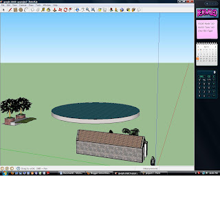
Google SketchUp...not my fave!


Hmm...I really did NOT like this project! And it didn't turn out very good, either. Blah.

Wednesday, April 6, 2011

Art Practicum Reflection


I work in a school. I seriously love my job so much already, I knew that this assignment was going to be a breeze. I already know how to deal with kids and their behavior issues. I know how to run the teacher's smartboards...I enter scores for them in the computer, and I've taught dozens of little mini-lessons. So, going into this project, I had relatively high expectations, and I'm happy to report, for the most part, that the kids rose to my expectations. This was a good thing, because I did not want to have to lower my expectations. So, I did a Pablo Picasso head lesson plan, but I simplified it. First, I showed them a slideshow I had put together that showed Picasso's work, and gave some Art terms. We had a class discussion about Art, and if Picasso's work was Art. Next, I had them critique a few pictures, and tell me what they liked/disliked about the picture. After that, I handed each student 2 pieces of paper. On the first piece of paper, they were to draw a shape. It could be any shape: circle, square, triangle, or a made-up shape. They drew a line of symmetry down the middle of the shape. Next, they folded their second piece of paper in half hamburger-style. On the top half of the paper, I had them draw their face shapes- eyes, nose, mouth, etc. On the bottom half, I had them draw 3-4 patterns. Next, I explained the process of moving the patterns onto their face shape. I wish I had a better way to teach this, because we struggled with this part in all three classes... Anyway, next, I had them draw and color their patterns into their face shapes. Next, we cut out the face shapes. I then explained about dividing the face into sections. Each section had to be a different color. After they were done coloring, we glued the face shapes onto their head, and added hair. All-in-all, I think it went really well. Because I've had so much experience in the school system, this went fairly easy for me. :) There were a few kinks that had to be worked out, and I modified this lesson as we went along, but over all, a very good lesson, and a very positive experience.

Monday, April 4, 2011

Wire Sculpture


This is my wire sculpture...and it's a lion. It looks NOTHING like a lion. Haha.This was a fun project, but it took me forever to do, and it looks like it was done in 5 seconds. I was blind, and after looking at everybody else's blogs in class and then again at home, maybe I should have had a physical handicap. I think it would have been a lot easier for me to complete this project with gloves on versus what I did, which was blindfold myself. If I do this project again, I am going to wear mittens next time.

Modeling Clay Animal


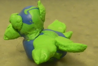
Ugh! Technology issues are going to be the death of me this semester! I went to upload my stuff at 6:30, and my internet was down. :( Anyway, this is my durtle. It's a cross between a duck and a turtle. It eats plants, and small fish. It lives in saltwater environment, and it can dive like a turtle, and swim like a duck...and he's cute.

Friday, April 1, 2011

Second Grade Lesson Plan- Lines & Color

Lines & Color

Second Grade Lesson Plan

Tara Peterson

Art 3700

Objectives

· Students will use color and line to create an Abstract work of art. (A)

· Students will apply contrasting colors to create an emphasis area. (C,A)

Standards Addressed

· Use a protractor and/or ruler to make interesting abstract patterns.

Overlap shapes to create a design. Use secondary colors to fill in design.

(Build Skills Practice.)

· Apply contrasting colors to create an emphasis area in a painting using

paint or colored construction paper. (Research Create)

· Combine geometric shapes to create more complex new ones.

(Explore Contextualize)

Materials

Different colored paint

Colored pencils

Markers

Crayons

Art paper

Paint aprons

Paintbrushes

Rulers

Masking tape

Vocabulary

Contrasting Colors: Two colors from different segments of the color wheel are contrasting colors. For example, red is from the warm half of the color wheel and blue is from the cool half. They are contrasting colors.

Abstract Art: Abstract art uses a visual language of form, color and line to create a composition which may exist with a degree of independence from visual references in the world.

Pedagogy

Start off by explaining to the kids what abstract art is. Bring out some examples of Abstract artist’s work. Give each student a piece of paper, a ruler, and the art supplies. Have each student tape off a border for their work. The students will then make many different geometric shapes with their rules. After they have completely filled the page with geometric shapes, they will use their different art media (paint, colored pencils, crayons, markers) and will fill in the shapes with primary, complementary, contrasting, warm, and cool colors. After they are finished, they will let their pictures dry, and will then mount them on a larger piece of construction paper, and will make a wall mural.


Teacher Resources

Abstract Artist’s work

Assessment

· The student’s work will be assessed in the following criteria: Did the student fill the entire page? Did the student use all art media? Did the student tape off a border on their piece of paper? Did the student use primary, complementary, contrasting, warm, and cool colors? I will walk around while the students are working, and will silently assess them, and they will be assessed a 3-2-1-0 on a rubric.

3 (Excellent)

2 (Average)

1(Below Average)

0 (Unsatisfactory)

The student filled the entire page

The student filled most of the page.

The student filled some of the page.

The student did not fill any of the page, or did not try.

The student used all of the art media (colored pencils, markers, crayons, paint).

The student used most of the art media (colored pencils, markers, crayons, paint).

The student used some of the art media (colored pencils, markers, crayons, paint).

The student did not use the art media (colored pencils, markers, crayons, paint).

The student taped off a border on their piece of paper.

The student taped off a border on most of their piece of paper.

The student’s border was crooked or not even.

The student did not tape off a border.

The student used primary, complementary, contrasting, warm, and cool colors in their artwork.

The student used most of the primary, complementary, contrasting, warm, and cool colors.

The student used some of the primary, complementary, contrasting, warm, and cool colors.

The student did not use primary, complementary, contrasting, warm, and cool colors.

Adaptations/Integrations/Accommodations

This could be used in older grades as a Math integration.

Third Grade Lesson Plan - Squashed Art

Squashed Art

Third grade Lesson Plan

Tara Peterson

Art 3700

Objectives

· Students will recognize colors on a color wheel. (C)

· Students will mix primary colors to make secondary colors. (C)

· Students will talk about how different colors make you feel (C,A)

· Students will recognize lines of symmetry in their environment and in art. (C, P)

Standards Addressed

· Identify and name colors in a simplified color wheel showing only primary and secondary

colors. (Identify Experience)

· Mix primary colors to make secondary colors.

· Experience color mixing variations by placing colors on one half of paper, folding it in half to

create a mirror image

· Compare and contrast old master’s use of color. Discuss how color impacts the emotional

feel of the painting (aesthetics).

·

Materials

Red, yellow, and blue paint

White and black cardstock

Paint aprons

Paint cups

Vocabulary

Line of symmetry: A line of symmetry divides a figure into to halves that are the mirror images of each other.

Pedagogy

1. Have each child put on a paint apron, and set up art stations at the front of the room with the paint cups. Pass out three paint cups to each table. Pass out a piece of white cardstock and a piece of black cardstock. Next, take out your examples of pictures with lines of symmetry. Explain that a line of symmetry divides something into halves that are mirror images of each other. Draw a square on the board, and draw a line down the middle. Ask the kids if the square is symmetrical or non-symmetrical. Draw a few more shapes on the board, and do the same thing. Next, draw a design on the board that is not a shape. Draw a line of symmetry on the board, and ask the kids if it is symmetrical.

2. Fold the paper in half, creating a line of symmetry. The students will dribble red, blue, and yellow paint over their papers. Make sure you remind them not to put too much paint on their papers, otherwise it will soak through. Next, the kids will “squash” the two halves of their papers together, and will un-do the paper, showing their symmetrical “squashed art.” They will do this on both the black and the white paper. Next, we will have a discussion about the different colors, and how they make us feel.

3. Allow the artwork to dry, and then hang the artwork on the wall to display it.

Teacher Resources

I will need student examples to show the students. I will also need some posters showing lines of symmetry, and color emotion posters.

Assessment

I will walk around the classroom, and will make sure they use each of the primary colors to make their squashed art. They will participate in the class discussion about color and emotions.

Accommodations/ Adaptations

This lesson is an integrated Math lesson on symmetry. You could accommodate students in your classroom with disabilities by folding the paper in half for them, and by using cups with large spouts and large handles to making pouring the paint easier for them.